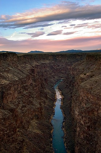
I’ve been reading Dan Margulis’s masterful Photoshop LAB Color: The Canyon Conundrum and Other Adventures in the Most Powerful Colorspace. I thought I’d give some of the techniques he explains a try, starting with this image. I’m admittedly a piker with LAB color, but after this experience I’ll be using it more, and learning more about it.
You select LAB color on the Photoshop Image>Mode menu as an alternative to RGB (for computer monitors) or CMYK (for printing). You can’t really output anything in LAB, so a final step in any workflow in which you’ve converted to LAB is likely to be a conversion back to RGB or CMYK (depending on what you plan to do with the image).
The LAB color model consists of three channels. The L channel stands for luminance. Actually, this channel controls the contrast in the image, and appears in Photoshop as black and white. There’s some additional technical complexity in the way the A and B channels work, but essentially A controls the magenta to green spectrum and B controls the yellow to blue spectrum (both channels using a mechanism called the “opponent-color scheme”).
LAB color was originally specified by a standards body, the International Commission on Illumination (CIE). As the Wikipedia puts it, the LAB color model “is the most complete color model used conventionally to describe all the colors visible to the human eye.”
With the photo above, I converted to LAB color pretty early in my workflow. I was able to use the Curves dialog in Photoshop to easily color correct both the canyon area and the sky. By way of comparison, and to show what an excellent correction this is, here’s a link to a similar image from the same set that I processed a while ago without using LAB.
katiemichelle
30 Aug 2006I love the tones in this one. I looked at the other version (withouth LAB) and really appreciate that picture as well, but there is something “digital”, something “photograph” about it. Had I only seen the older photo, I probably wouldn’t have thought twice about it. Its a beautiful image, its got great color and it really pops out, but the comparison is really incredible. I mean, with the LAB photo I feel like I’m ACTUALLY looking at this place, rather than seeing it on a wall or in this case a photoblog. Just my opinion I guess.
Thanks for the compare and contrast and all the extra info in there. Really beautiful shot.
Pingback: Photoblog 2.0: » Photoblog 2.0 Archive: » Summer Haze
Pingback: Photoblog 2.0: » Photoblog 2.0 Archive: » Gladiolus
Pingback: Photoblog 2.0: » Photoblog 2.0 Archive: » Capillarity
Pingback: Photoblog 2.0: » Photoblog 2.0 Archive: » Bougainvillea
Pingback: Photoblog 2.0: » Photoblog 2.0 Archive: » Xrays, Photograms, and Cross Processing, Oh My!
Pingback: Photoblog 2.0: » Photoblog 2.0 Archive: » Cyclamen
Pingback: Photoblog 2.0: » Photoblog 2.0 Archive: » Nautilus 69
Pingback: Photoblog 2.0: » Photoblog 2.0 Archive: » Golden Wonder
Pingback: Photoblog 2.0: » Photoblog 2.0 Archive: » Persistence of Vision
Pingback: Photoblog 2.0: » Photoblog 2.0 Archive: » Roughly, Millenium
Pingback: Photoblog 2.0: » Photoblog 2.0 Archive: » Faerie Rose on Black
Pingback: Photoblog 2.0: » Photoblog 2.0 Archive: » Faerie Rose on Black
Pingback: Photoblog 2.0: » Photoblog 2.0 Archive: » Trio of Double Hellebores
Pingback: Photoblog 2.0: » Photoblog 2.0 Archive: » Same Fuschia This Year
Pingback: Structure | Photoblog 2.0
Pingback: Nautilus Cross Section | Photoblog 2.0