In a previous story, I showed imposition proofs for my Light & Exposure for Digital Photographers laid out on our living room floor. I noted that the book is due out in the next few months, published by O’Reilly, and is being printed in Italy. As I explained, imposition proofs are used to determine the layout of the book into signatures for printing, and are not intended to be used to check color. Each signature is a large sheet that goes through the printing press and is cut up into individual pages of the book.
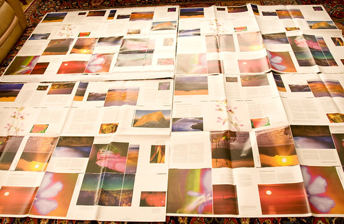
In contrast to the imposition proofs, the signature sheets shown in the photo that runs with this story are used to check color. Together with Dennis, the production editor on the book, we chose the toughest signature in the book. The printer used a proofing press to create the press proofs of this tough signature. These proofs are supposed to provide color samples very close to the final product.
There are four different versions of the press proof sheet shown in the photo, once again on our living room floor.
Starting on the upper left, and moving clockwise, the first sheet shows the pages we generated as proofs from our CMYK Epson 4800. These pages were produced using the ICM profile provided by the printer, and theoretically should be very close to the pages produced by the printer.
The next sheet to the right was produced on the proofing press using normal 4-color process CMYK inks. Apparently, the printer felt this sheet didn’t have quite the punch of the version we had provided, so on the next sheet they substituted rhodamine red, a more vibrant ink, for the process magenta. The final sheet was generated using 50% process magenta and 50% rhodamine red.
Dennis was over today in our living room looking at these prints with us. This is partially an economic decision, because substituting a color is an expense. We pretty much ruled out the 100% rhodamine red version; it does punch up the colors, but in some cases it punches too much.
The truth is that all three versions of this signature, and it is a tough signature, look pretty good. I think the 50% rhodamine and 50% magenta is probably the best choice. Dennis is getting on the phone with Italy to make sure that if he specifies that half-and-half blend that it will be consistent throughout the press run, and (God willing) on reprints.
Although I’m really excited about the way the book is looking from the press proofs, whichever choice is made it won’t look best on all the photos in the signature, or indeed all photos in the book. Printing is not an exact science, and like life itself involves compromise.