
Based on comments from readers and my own research, here are another couple of conversion techniques that you might like even more!
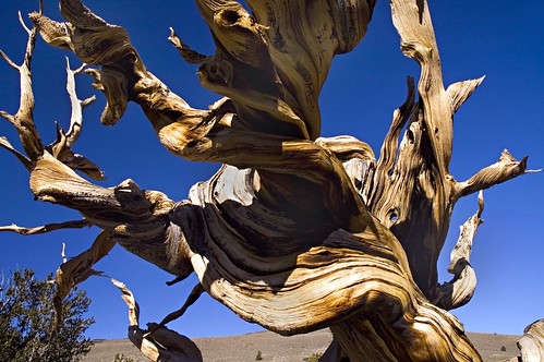
For the record, here’s the original color photo:
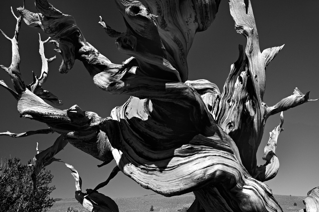
The black and white version at the top, like the first version in the previous post, was obtained starting by converting the color space from RGB to Lab. With the color space converted, I then took the following steps:
- Discarded everything but the Lightness (L channel) by making it active, then choosing Image > Mode > Grayscale
- Created a duplicate layer
- Blended it with the original background layer using Multiply
- Took down the opacity of the blend until I was happy with the way the b&w photo looked
Pretty simple, right? The next method probably gives you the most control over final results of any of the techniques I’ve explained.
Here’s the black and white image I ended up with:
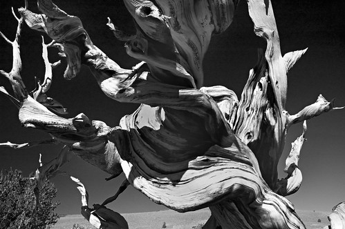
View this photo larger.
Here’s how I got there:
- Using the Layers palette, I created an adjustment layer by selecting Channel Mixer from the Layers palette drop-down menu.
- I checked the Monochrome box at the bottom of the Channel Mixer
- In the Channel Mixer, I used the Red, Green and Blue sliders to tweak the image (see the comment below about the settings)
- I tweaked the overall brightness of the image slightly using the Constant slider
I liked this method best I think, because the ability to tweak the three channels (Red, Green, and Blue) with sliders, with each channel contributing to the result, seems very flexible and intuitive. Normally, you want to keep the total of the three sliders to 100%. It’s possible to create dramatic effects by deviating from this. To create this kind of drama, you typically increase two channels way high, and compensate by making the thrid channel a negative percentage.
For example, a Channel Mixer setting that has been called the Ansel Adams effect would be Red +160%, Green +140%, and Blue -200%. This still totals 100%, but when I tried on this photo, the results looked garish to me. The result above is a more modest Red +70%, Green +50%, and Blue -20%. I think this adds a tad of glamour without going overboard.
Pingback: DSLRBlog
Pingback: Photoblog 2.0: » Photoblog 2.0 Archive: » Going with the Grain
Pingback: Photoblog 2.0: » Photoblog 2.0 Archive: » In the Bag
Pingback: Photoblog 2.0: » Photoblog 2.0 Archive: » Toned
Pingback: Photoblog 2.0: » Photoblog 2.0 Archive: » Nautilus in Black and White