Back when I was in high school, I was often asked to write essays that compared and contrasted two things or concepts. As a professional writer, I find that “compare and contrast” remains often a good organizing principle. Or at least an easy one. If you can compare and contrast two things that are different, but have some similarities, then you don’t really have to think about the things in an original way. Compare and contrast is pretty much an algorithm that becomes a routine.
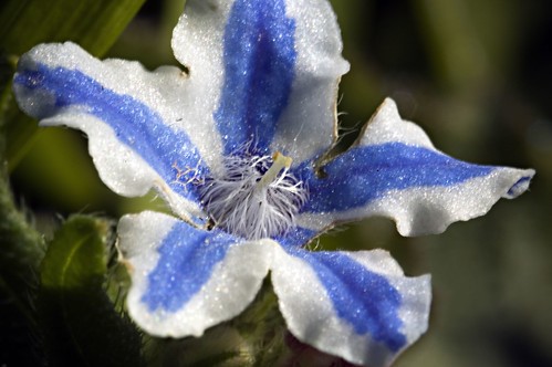
I found this white, blue-striped flower hiding under some leaves in my front garden. The blossom pictured is very, very small with a total diameter of about 1/4″ (less then one centimeter). If any reader can help me identify the flower, I’d appreciate it.
The photo above was taken with my 105mm Nikkor macro with 68mm of extension tubes, tripod mounted, stopped way down to f/32. In other words, conventional painstaking high depth of field macro.
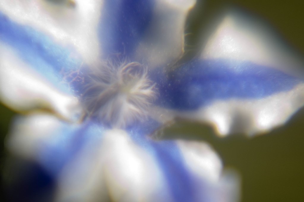
In comparison and contrast, the photo below was taken with my Lens Baby mounted with the +14 macro filter kit and the macro portion of the Tokina .45X wide angle lens that Lensbabies sells (I can’t really find the specification for the diopters this thing adds, but obviously it is substantial). This was wide open (the equivalent of f/2.0), low depth of field, and handheld at 1/1600 of a second.
I like both version of this compare and contrast, and think both look better in a larger size (click here and here to open larger versions of each photo).
Which version do you prefer? In this case, I slightly prefer the conventional photo to the Lens Baby photo: I tend to think that Lens Baby are best when they are used expressively, and not to reproduce a conventional effect. Please let me know what you think.

View this photo larger.
Pingback: Photoblog 2.0: » Photoblog 2.0 Archive: » Flower Warp Core