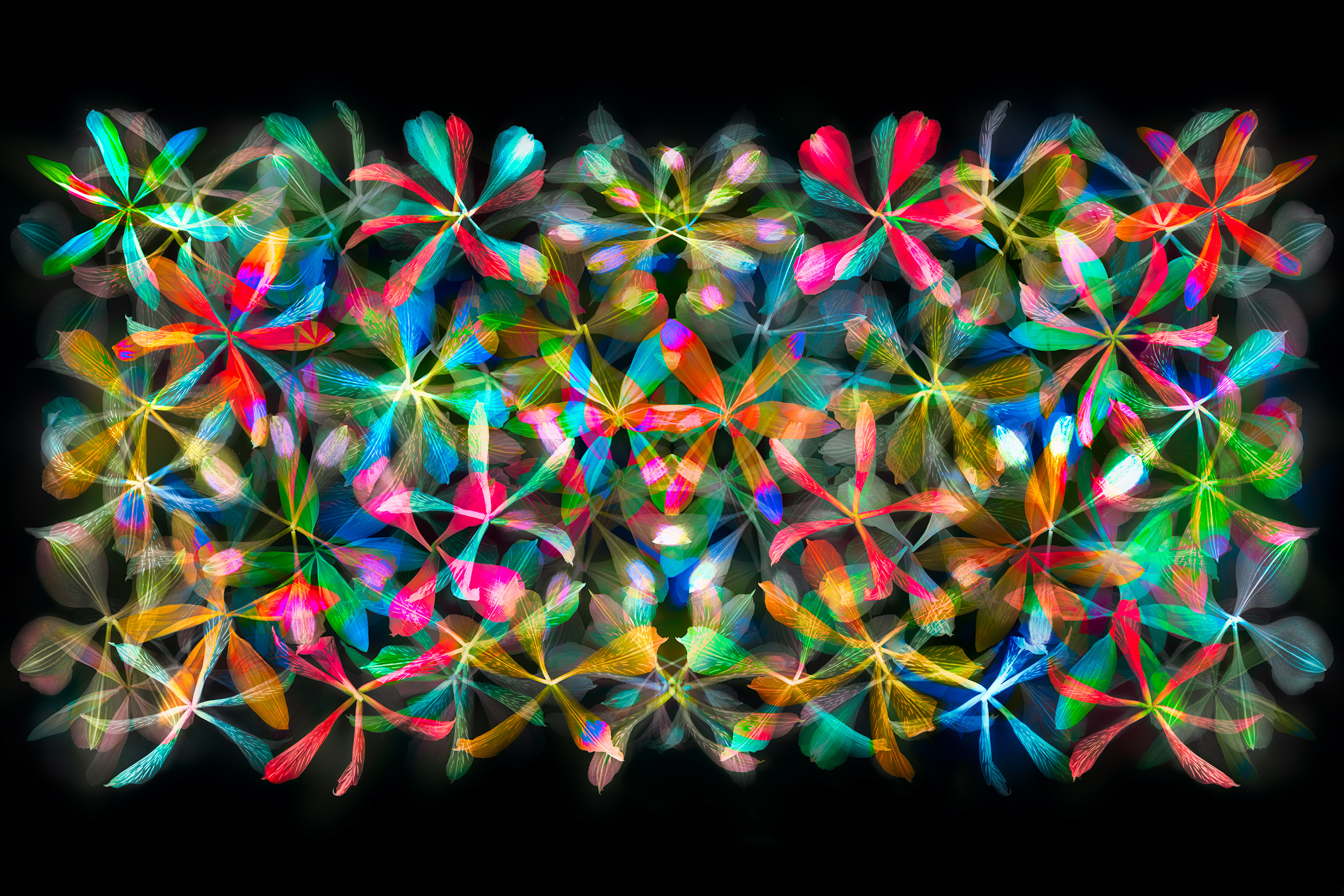
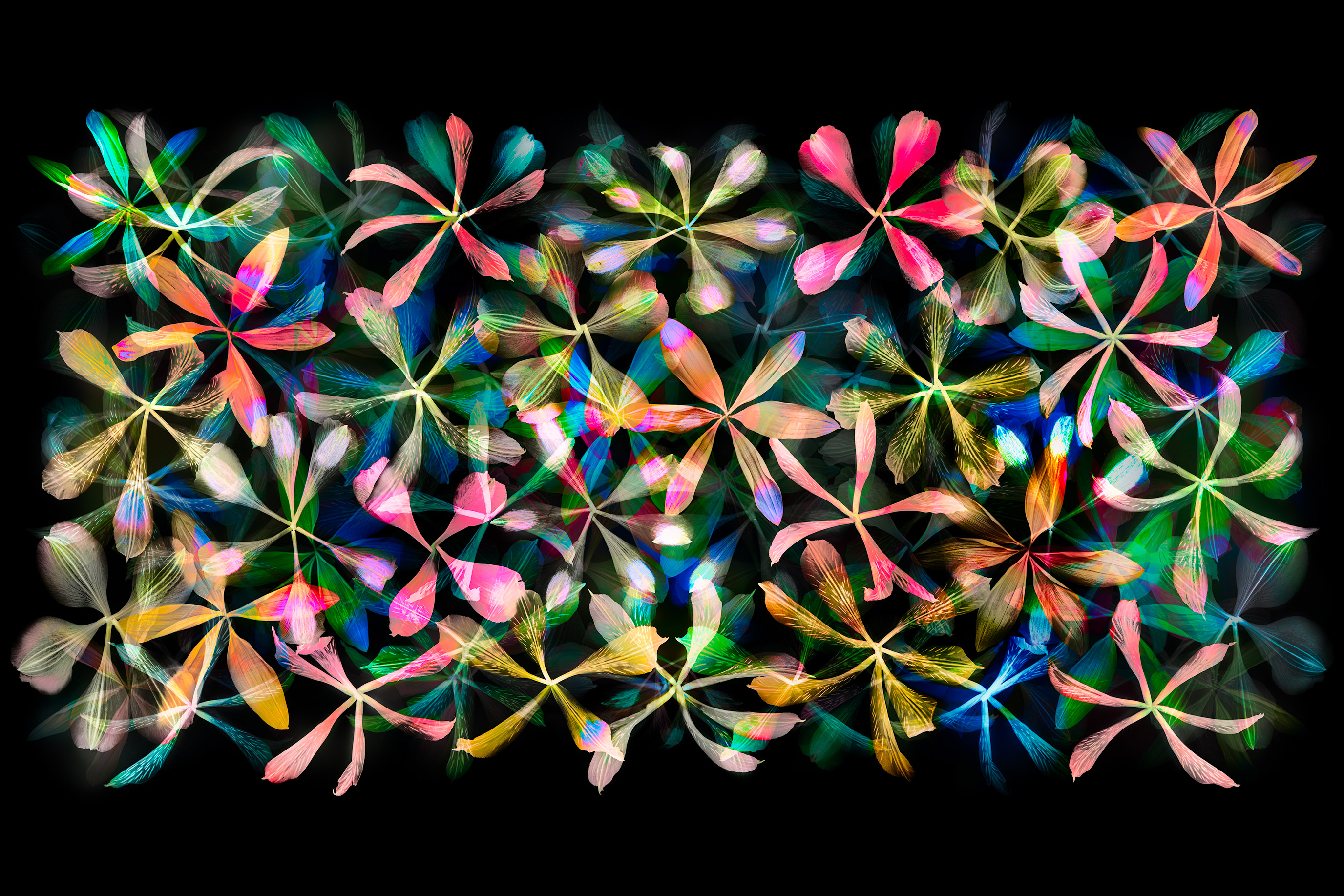
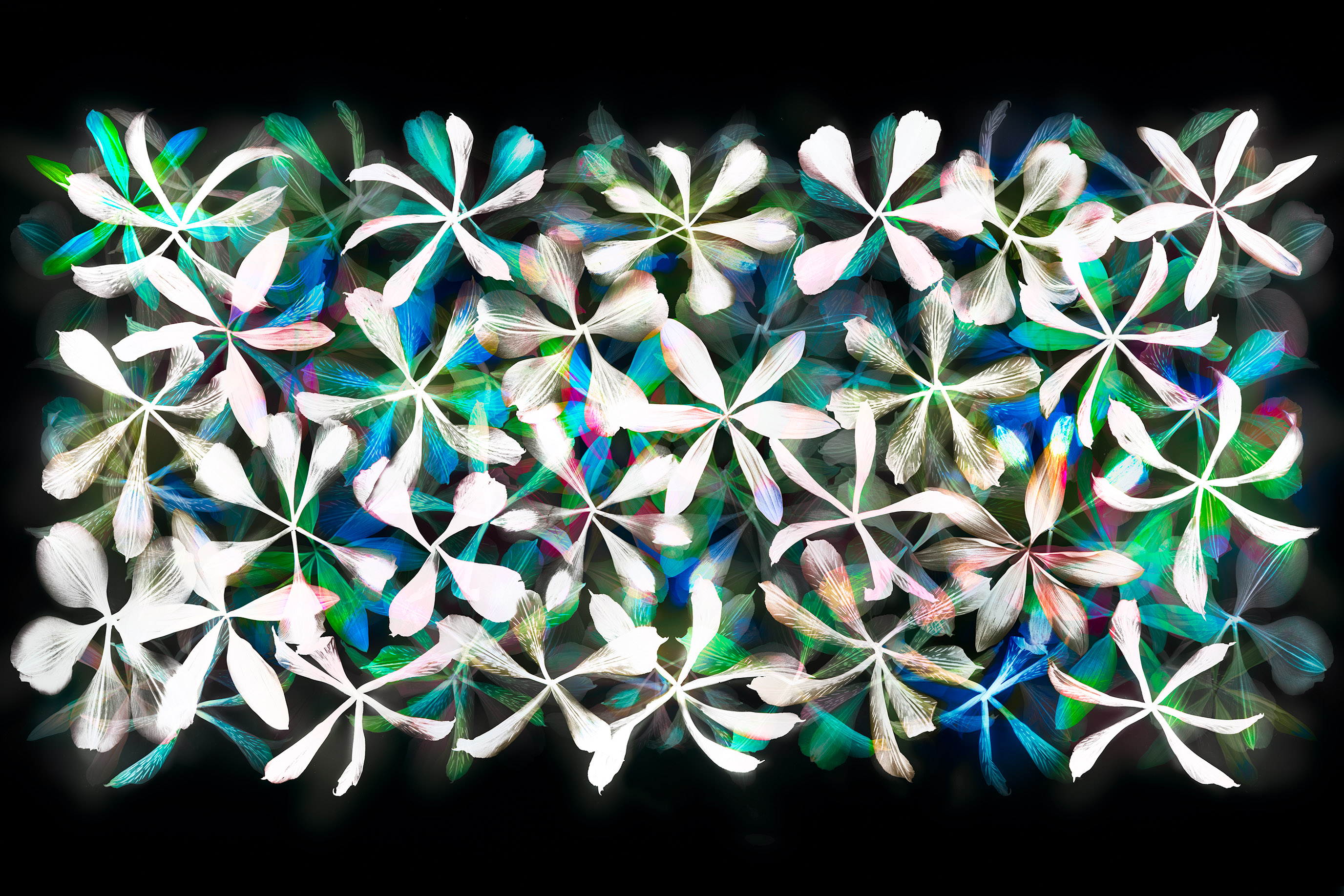
Personally, my original choices still hold! I think the calligraphic version has lots of potential. I just don’t like the (in my opinion) garish flouro artifacts that occur in places, and an impression of ‘muddy’ coloured components. Continuing re the calligraphic one… I really like the ‘flower’ that’s right at the top, just right of centre. It has a particularly pleasing mix of red and green. Those particular colours are a pleasure to look at for me – ‘hues’ might be the word, and the brightness is nice but not overdone. Parts of this version really appeal to me, there’s a lovely soft watercolour effect in places that’s very subtle and ever so pleasing. As before, I qualify my observations by saying I am viewing these on a small laptop screen.
Liz
18 Nov 2017Personally, my original choices still hold! I think the calligraphic version has lots of potential. I just don’t like the (in my opinion) garish flouro artifacts that occur in places, and an impression of ‘muddy’ coloured components. Continuing re the calligraphic one… I really like the ‘flower’ that’s right at the top, just right of centre. It has a particularly pleasing mix of red and green. Those particular colours are a pleasure to look at for me – ‘hues’ might be the word, and the brightness is nice but not overdone. Parts of this version really appeal to me, there’s a lovely soft watercolour effect in places that’s very subtle and ever so pleasing. As before, I qualify my observations by saying I am viewing these on a small laptop screen.
Pingback: Harold Davis—My Best of 2017