In November of 2007, while I was clambering around Zion Canyon at night, exploring the Wave, and getting lost in the desert, Phyllis fielded a business call from Ringing Cedars Press. Ringing Cedars is the English language publisher of a series of books by Vladimir Megré.
The Ringing Cedars series conveys the wisdom, strength, and experience of Anastasia, a woman found naked upon the Siberian taiga. Anastasia provides insights on a wide range of topics ranging from health and utopian lifestyles to the measures needed to save our earth. Apparently, there’s a mysterious energy encoded in Anastasia’s words, and the more you read the books “the better you’ll feel.”
The Ringing Cedar series is a massive bestseller in Russian. While an English edition was in print at the time the Ringing Cedars publisher contacted us, the publisher was interested in creating a completely new and elegant design for the United States market. To this end, the publisher had hired noted book designer (and artist) Bill Greaves and conducted a massive artist search.
The goal was to find an artist with a body of work that could used as cover art. The cover art had to convey inspiration, and that it was both natural and imbued with a strong, creative life force. In addition, the art needed to be unique, distinctive, instantly recognizable, and cohesive. With these requirements in mind, the Ringing Cedars publisher was interested in my Digital Photogram series, which they had found on the Web. You can read more about some of the techniques I used to create this style of image in Xrays, Photograms, and Cross Processing, Oh My!
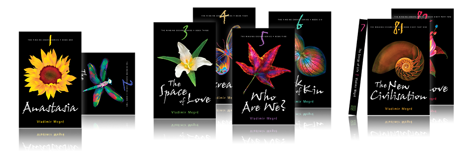
Here’s a product shot of the nine Ringing Cedars covers in a group.
The deal that I eventually negotiated with Ringing Cedars for the cover art was interesting because it was one part licensing, and one part assignment. Six of the images that wound up being used on the series cover were licensed, with minor modifications in some cases. On the other hand, I created three new cover images to fit the specific needs of the series titles. I always enjoy this kind of creative image creation, which usually leads me into some neat places in the process of fulfilling the needs of my client.
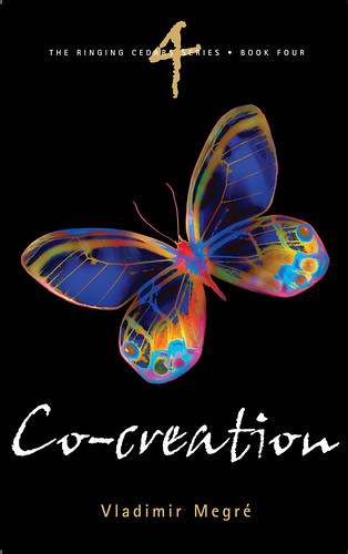
In the same way that the business arrangements were both fish and fowl (licensing and assignment), in a very real sense all the Ringing Cedars cover images involve both photography and digital painting. Each cover image is different in terms of where it falls on this spectrum. For example, the sunflower used for the cover of the first volume (“Anastasia”) is pretty much a digital photo, whereas the butterfly used on the cover of the fourth volume (“Co-creation”) is mostly digital painting from an original photo. That said, I think the team consisting of the publisher, the designer Bill Greaves, and Phyllis and myself, did a wonderful job of coming up with a cohesive look across a wide range of subjects. Generally, I’m appreciative of how well this team worked together. It’s rare in my professional experience to have a group of creative people working together with so much good will and positive energy.
Without further ado, here are the nine Ringing Cedars covers (along with some links to stories about how the images were created).

I blogged the image used on this cover here. We ultimately cut the flower off its stem to make it “float” on the black background. At the request of the client, I also worked in Photoshop to enhance the red glow in the center of the flower.

I blogged the image used on this cover here. More dragonfly images in this series.

I blogged the image used on this cover here.
I blogged the image used on this cover here.

I blogged the image used on this cover here.
I blogged the image used on this cover here.
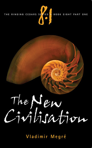
I blogged the image used on this cover here.

I blogged the image used on this cover here.
Pingback: Photoblog 2.0: » Photoblog 2.0 Archive: » Stephanorrhina gaffata
Marta Gradilone Rodr
16 Jul 2022I love the art of these covers. Do you have any idea why these books stopped being printed? I’ve been wanting to read them, but not at $50/book. If they’re so popular, I’m confused why the publisher wouldn’t print more … Would appreciate your thoughts, if any. Cheers!
Harold Davis
16 Jul 2022Thanks Marta for your kind words about my cover art. I really don’t know why these went out of print—my only role was creating the cover art—but it may have had something to do with conflicts between the various stakeholders. Best wishes to you, Harold