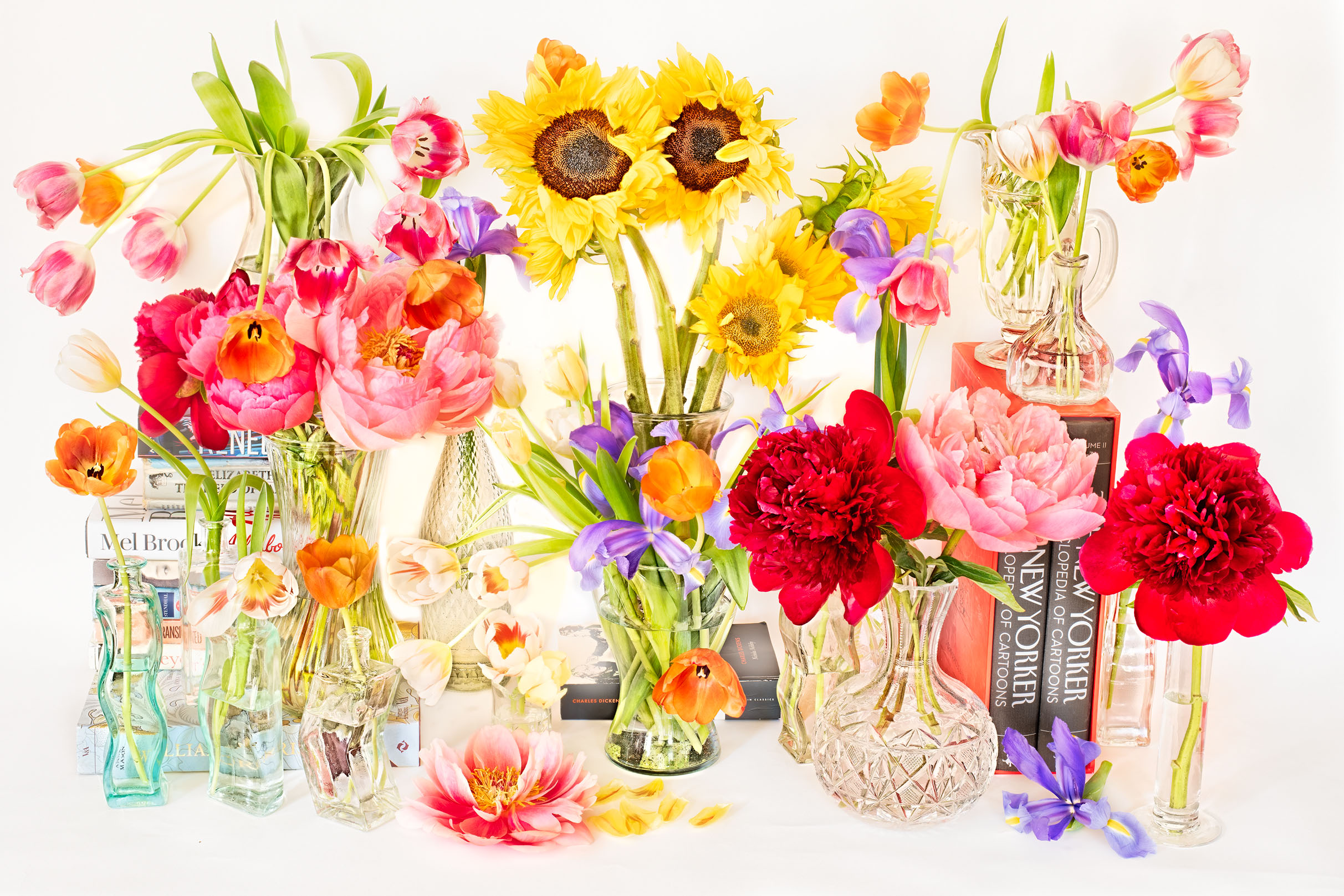
I’ve been experimenting with creating images that look a little like a wall of flowers one might see at a florist shop. From a set design viewpoint, an important challenge is how to establish multiple vertical “levels”—because a single row is basically boring, and not a good way to create a three-dimensional wall.
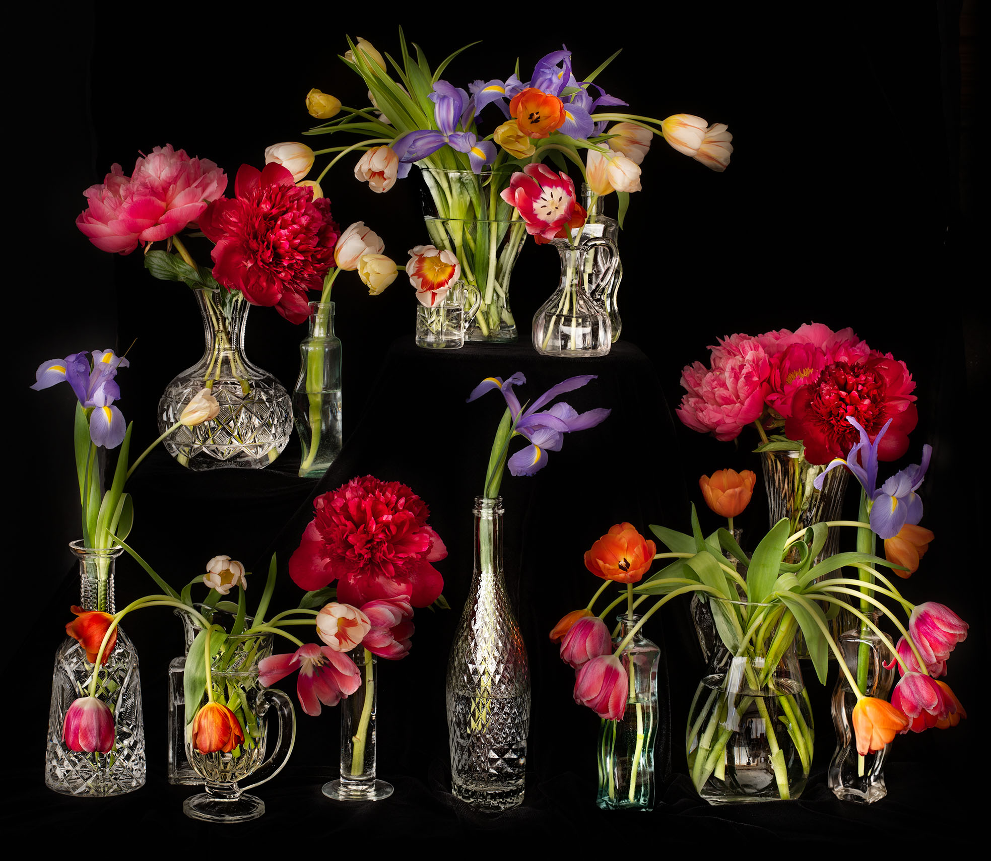
With the version on black (below), I dealt with this issue by adding supports behind the black velvet background. I think this works pretty well, but if you consider the image there is a certain “I’m floating in air” aspect to the composition.
I like the version on a white seamless background best (top). With this setup, I decided to try a “form follows function” approach, and use visible supports to raise the height of some of the individual floral arrangements. To achieve this, I used spine-side-out books, notably the large collection of New Yorker cartoons shown on the right side (Charles Dickens and Mel Brooks are somewhat hidden in the background).