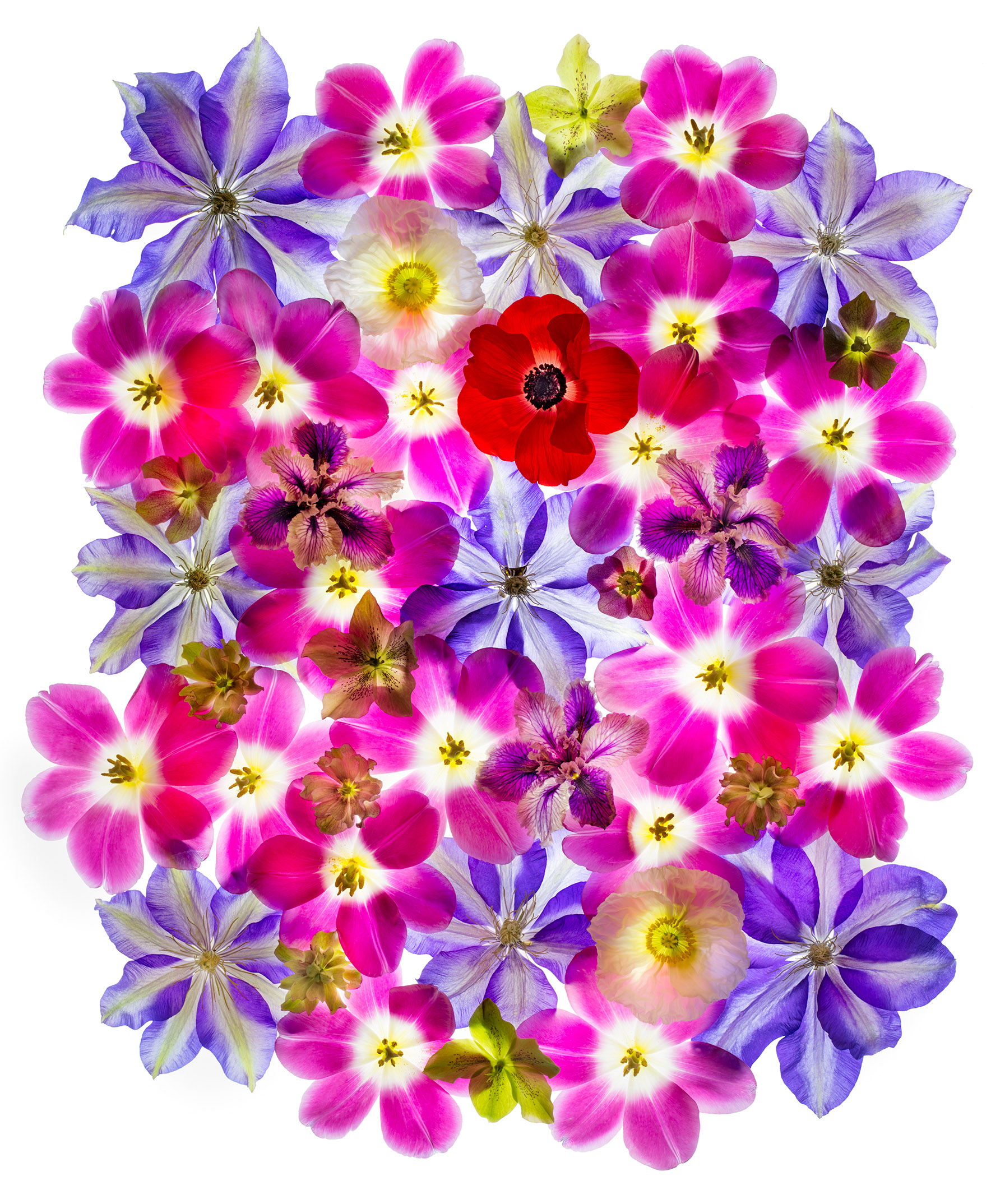
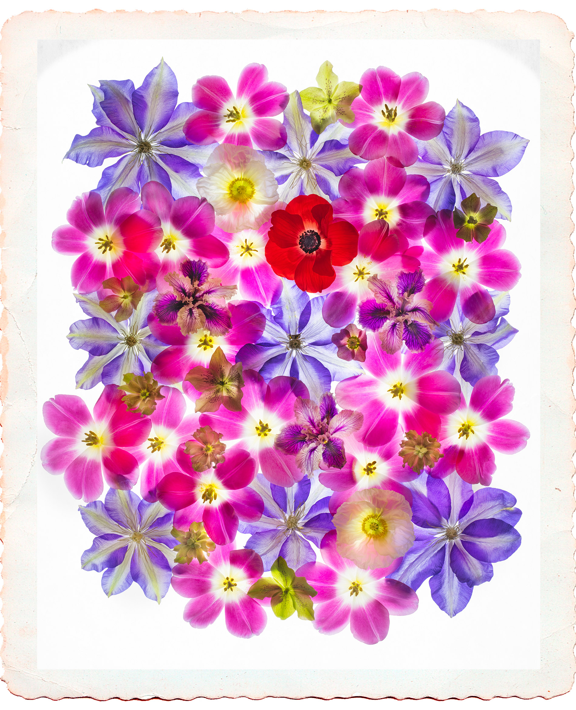
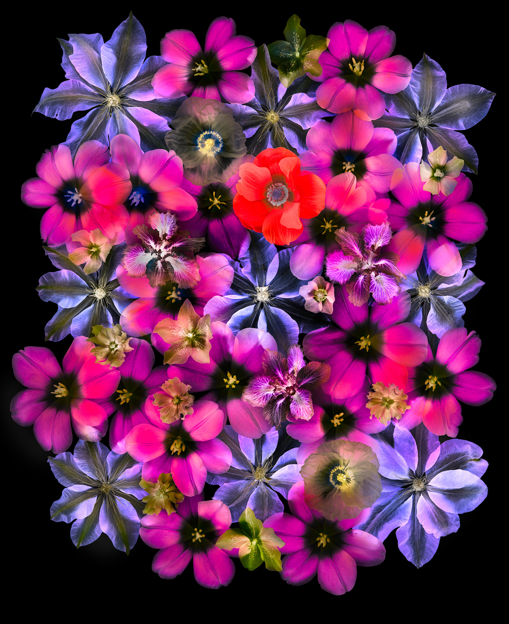
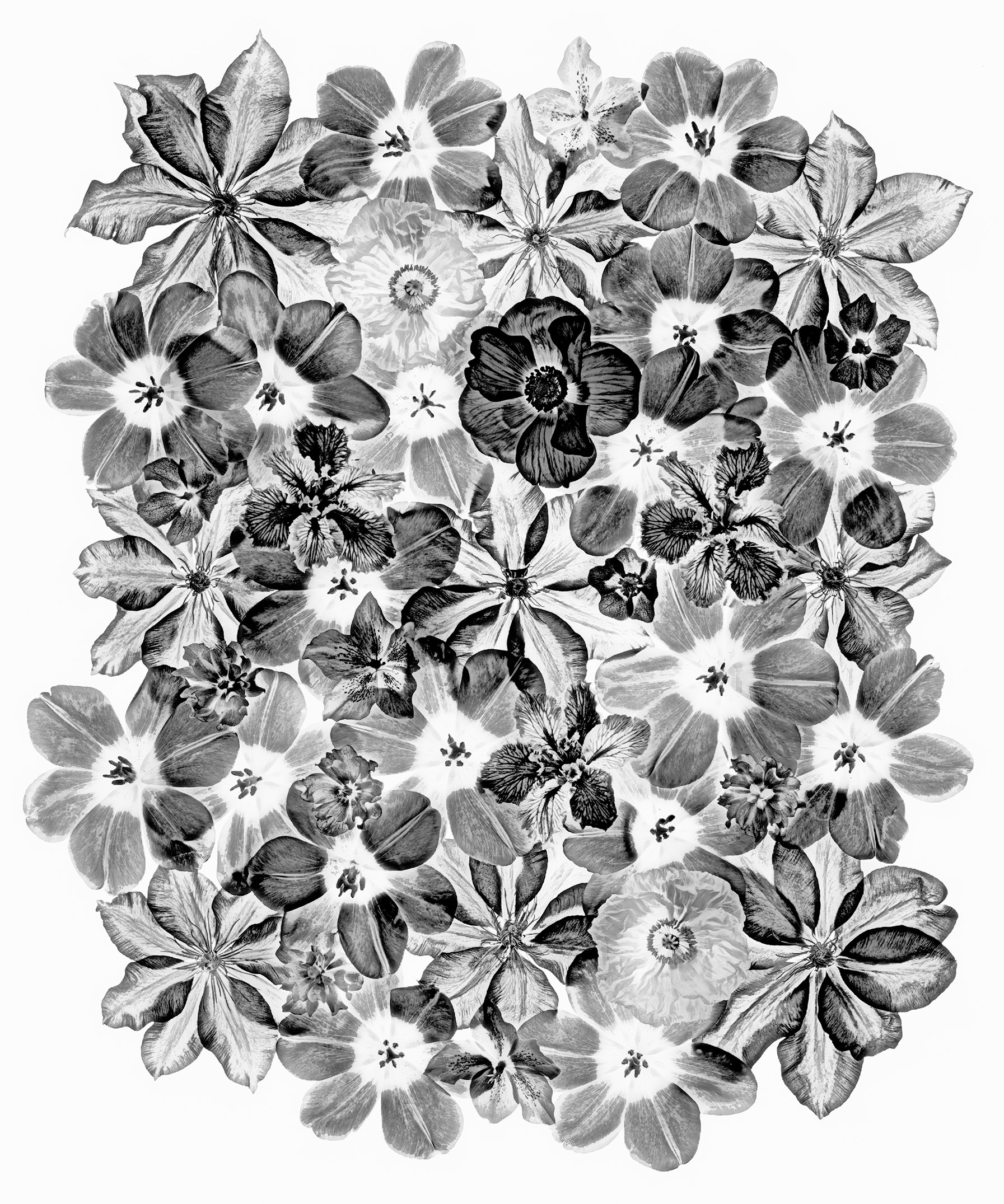
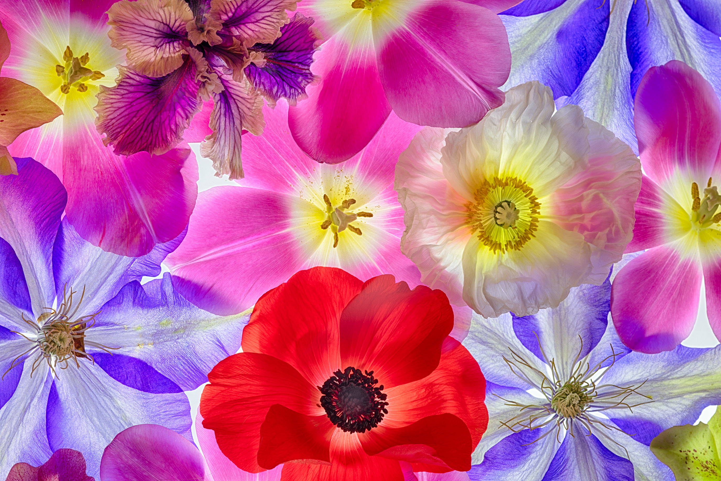
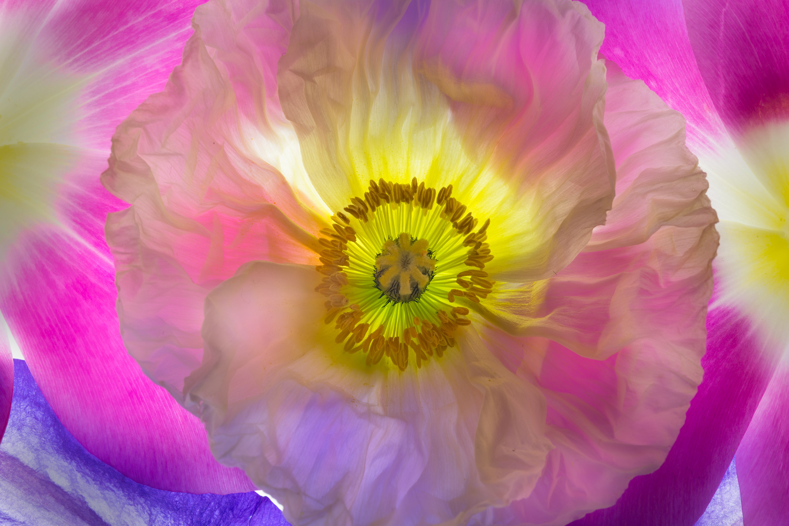
Thanks for participating in my previous request for comments on Decorative Grasses and Blades of Grass. Today’s Which variation do you prefer? And, why? involves six images. What these variations have in common is the subject matter: the same floral arrangement was photographed in each.
Four of the images involve different processing of the full composition, with a version on white, an inversion on black, a version with a virtual “frame,” and a woodcut-like black & white version. I have presented these images as verticals.
The other two images, shown as horizontals, involve closer-in captures, with a different (stronger) magnification.
Which do you like best, and why? I particularly appreciate comments entered directly on the blog story (the comment box is below, or follow this link!). Thanks.
Liz
29 Mar 2018I like the 2 horizontals best because they’re less ‘busy’ and I can appreciate the colours, transparency effects and textures much better. To me they are more subtle and have more depth. That last photo is quite wondrous to look at and through! Its very beautiful.
Gail Berreman
29 Mar 2018Of the full compositions, I LOVE the “Color Field of Flowers on White with a Deckled Edge.” It certainly is something I would hang on my wall.
Of the two close ups, the last and more magnified is my favorite of all! The light behind the center of the flower draws my eye and give me the feeling that it’s the flower’s heart beating.
Thanks for sharing, Harold!
CharleS
29 Mar 2018Selecting a favorite/preferred version from the first group of 4 verticals is almost like selecting between apples and oranges, but I do prefer the first one (unconstrained) and third one (inversion). Why? The first one seems better without a frame, as the 2nd one is somewhat framed. The third one is striking/impactful.
Of the horizontals, I favor the first one, which seems more dynamic to me, vs the single blossom.
R.M.Service
18 Apr 2018Your botanicals are quite intriguing. I get lost in ’em the longer I stare. The light background gives the arrangements an ethereal feeling, while the dark backgrounds drive a survey of details and sharpness.
I am also captivated by your phone images and your creative use of apps. I, too, find endless fascinations with what can be done on an iPhone. My two favorite apps are Bluristic and a mirroring app called Adjusta+, both of which produce quite interesting results.
Hope you have a great trip!
Ric